It started with a desire to uplevel our visual brand to better speak to the transformative qualities of the work we do and the impact we seek. We wanted to make the experience of engaging with our website (and other materials) to feel more like what our clients say they feel after they engage with us: joyful, energized, and ready to do the work.
Over the past year, we went on a journey of introspection and exploration for how we describe and represent ourselves as a company, in a particular time where social justice and inequities have moved even more into the cultural spotlight.
It has always been important to us to live our values and use them as a lens, and was critical to continue on this path in all the decisions we were making here—from font choices to strategic creative partnerships. Here’s a look at how our brand refresh came to life, the help we got along the way, and some guiding principles.
Your medium is your message
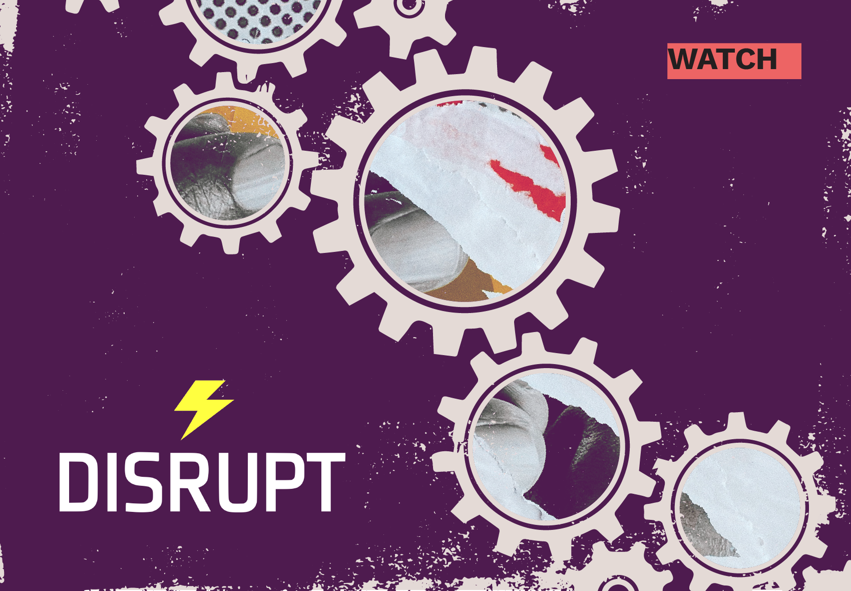
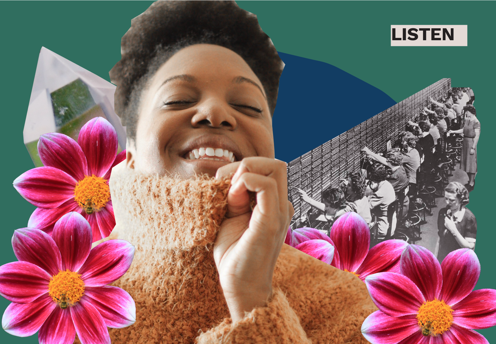
Collage has always been a core part of our visual identity. The physicality of collage brings a sense of craft to our work, and a reminder of the human touch involved in making. It signifies the idea of coming together to build something exciting and new from elements of the past, something transformative.
Only one refined brand collage lived on our former website, and while it told a story that we believed in, the limitations of how much story this one image could tell on its own was holding us back. We knew that we wanted to evolve our use of collage from a stand-alone image to a confident, signature style and a range of images that would represent different voices and identities, different pieces, different stories. We wanted to highlight a theme: of old ways of working contrasted with a more abundant future of work, made bright through powerful and hopeful figures shown with the agency to define their futures.
We enlisted the help of Rob Lewis, an artist and designer currently living in Portland, to help envision our collage system. It was important for us to find collaborators that connected with our values and the communities we serve. As an art director, he had an eye for how these collages could develop into a system, but he also brought the perspective of an artist working deeply in this medium.
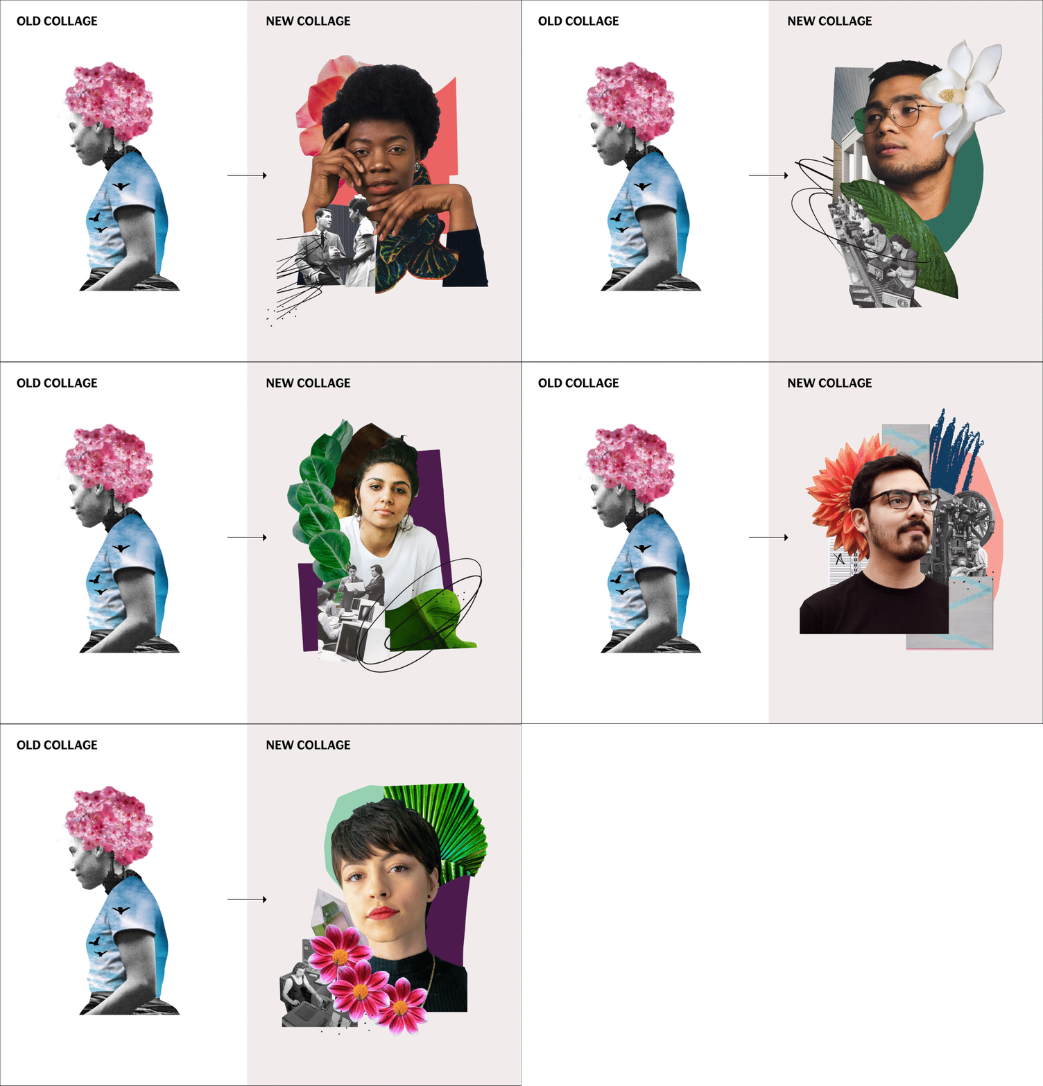
Part of our challenge was finding images of people that could bring a sense of power and hopefulness without tokenizing individuals or coming off as cheesy or cliché. After exploring some different collage styles and elements with Rob, we made a conscious decision to highlight the individual, keeping them whole within the compositions. Botanical elements bring a sense of bloom, going beyond growth to show transformation. The use of architectural and textural elements speaks to the real-world systems we’ll all help build together. Together the different collages build a mood that is greater than the sum of their separate parts and pieces.
Bringing in an outside partner with Rob’s expertise elevated the visual language we were using, tested assumptions on how we show a range of identities in our images, and inspired new ways we could use collage elements throughout our materials.
Live your values, even in the small decisions
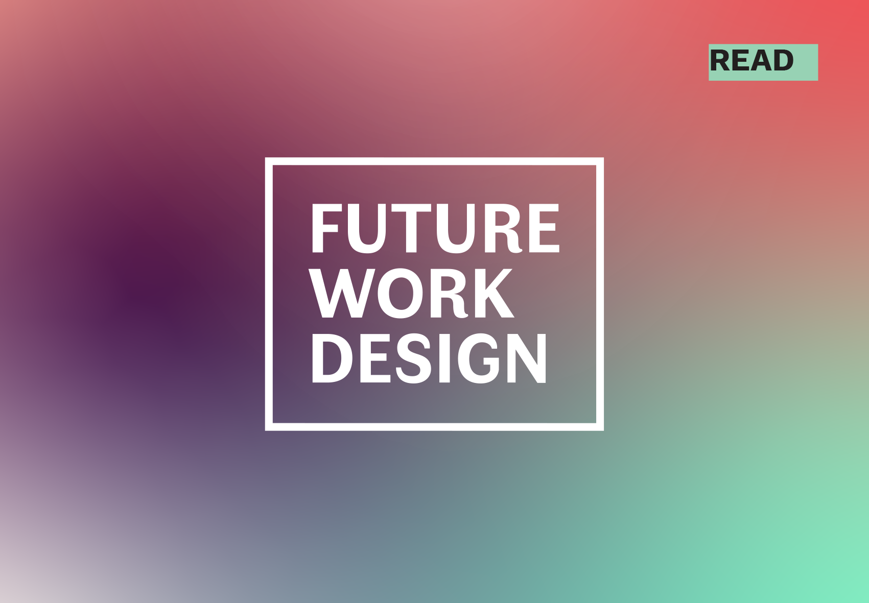
Though our previous logo was clear and bold, we wanted something with more personality and presence, and a type system that could bring more character to our design. We saw this as an opportunity to look beyond overused typefaces and overrepresented type designers, and consider how these decisions could better reflect who we are, even if folks don’t commonly see this info.
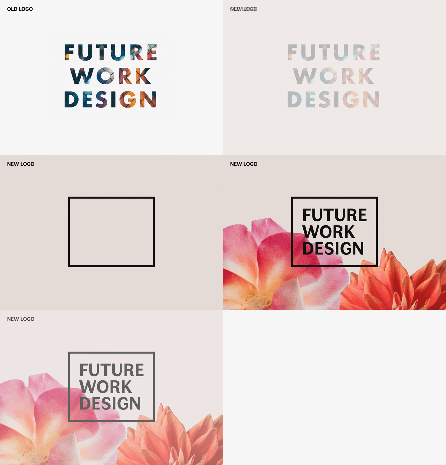
Faune, our display typeface, was designed by Alice Savoie. We chose it for its friendly feel and unique charm. Its unexpected thick and thin strokes and flourishes give it a handmade quality, but it still feels refined. Not only did we love the letterforms, but the story behind its creation is reflective of the work we do, as the design combines art and science, rigor and craft all into one. Alice provides an inspired look into her design process here. Faune was created as a commission by the Centre National des Arts Plastiques and the Groupe Imprimerie Nationale, and is available for use under the Creative Commons license CC BY-ND 4.0.
We used accessibility as a lens in finding a typeface that could complement Faune for longer blocks of text. We chose Work Sans, designed by Wei Huang, for its clear and fresh feel. It’s an open source, Google web font, tested for use across different languages and optimized for screen legibility, and easily downloadable by collaborators. And what better font name for a work revolution, than “Work Sans?”
Find power in partnerships
Part of what made our partnerships work throughout our visual brand/website refresh is that we brought in folks whose values aligned with our own; in particular, folks who shared a culture of experimentation and collaboration.
We joined forces with the talented team at Fortune Cookie, a woman-owned web development and creative firm, to make our website come to life. They enabled a fluid process, bringing me in to how they puzzled through code in real time, trying things out until we got something we liked. In the end, their willingness to work in this transparent, iterative way translated to a site that breathes with subtle animation, complex color shifts, and a fully responsive experience. Their process also ensured that we didn’t forego the accessibility and straightforwardness that makes the site more dynamic and usable in the end, for all our users.
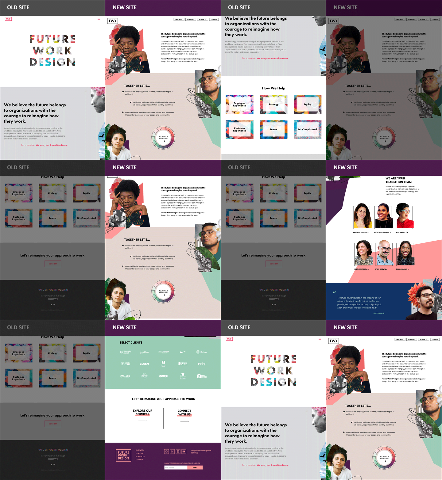
The messaging throughout the site is as critical as the visual elements. Lauren Gantner, of The Swell Co-Lab, was an essential and trusted partner throughout the whole process of design and creation. She brought expertise in marketing—and contextual knowledge of our team through past project collaborations—to build out more robust content and resources, help bolster our SEO, and make sure that our language reflected the personality of all the different people involved.
Working with partners who share a similar working style not only makes the process more fun and dynamic, but builds a more thoroughly tested and robust solution.
What’s next?
I’m so proud of the work we did to design something that is vibrant and true to our voice(s), that can actually grow, breathe, and evolve as we continue to evolve in our practice. Creating these new visual and structural systems allowed us to test and solidify the values that center us.
We’re poised to do a better job of sharing, with confidence—to celebrate and amplify the amazing work our clients are doing, to extend our reach and our impact. I’m so excited that we have a resilient foundation to build on from here!
Credits and Shoutouts
Rob Lewis
http://www.designculturelab.com/rob-lewis
Lauren Gatner
https://www.laurengantner.com
Fortune Cookie
https://www.fortunecookiecreative.com
Alice Savoie
http://www.cnap.graphismeenfrance.fr/faune/en.html
Wei Huang
https://charlix.cx
Unsplash Photographers
Photo by Dale Alejandro at Unsplash.com
Photo by Jorge Vicuna at Unsplash.com
Photo by Juan Manuel at Unsplash.com
Photo by Matthes Ferrero at Unsplash.com
Photo by Leighann Blackwood at Unsplash.com
Learn more about the work we do here.
